
Thingtesting Case Study
My Role
UX/UI Designer
Project Duration
3 Weeks
Tools
Figma, Tome, Google Suite
Overview
Thingtesting is the place to discover, research, and review internet-born brands. I created a mobile app as well as several additional features to improve Thingtesting’s reach and increase their user count.
Being a Supertester, I am already quite knowledgeable about the ins and outs of Thingtesting. They do a great job at summarizing what their goals are.
Background
“Our goal as consumers isn’t to buy everything, but to buy thoughtfully. And to do that, we need trustworthy reviews of products from other people who’ve tried them. That’s why Thingtesting is here: to create a platform where we help each other buy better. Come here to research brands before you make your own purchases, and share your reviews to help your peers buy better, too.”
-Thingtesting
Problem
Thingtesting's problem is that they are not well known and aspects of their website are not easily sharable.
Solution
My solution is to create an app with an advanced share feature. The user will be able to share brands and reviews to their friends within the app, as well as post them on social media.
Methodology
Empathize - Conduct in depth research, competitive analysis, and surveys.
Define - Brainstorm ideas and create personas for Thingtesters.
Ideate - Bring ideas to life by creating user flows, task flows, low fidelity wireframes, and a UI kit.
Prototype - Bring everything together into a high-fidelity app prototype.
Test - Run usability tests to identify errors and places for optimization.
Implement - Iterate on prototype based on findings from usability tests.
Empathize
To fully understand Thingtesting, their goals, their competitors, and their users, I conducted market research, surveys, and a competitive analysis.
Through my market research, I found that Consumer Packaged Goods Directory (CPGD), Direct to Consumer.etc (DTC.etc), and Influenster were the most similar websites to Thingtesting. To make the most direct comparison, I found the Olipop profile on each site.
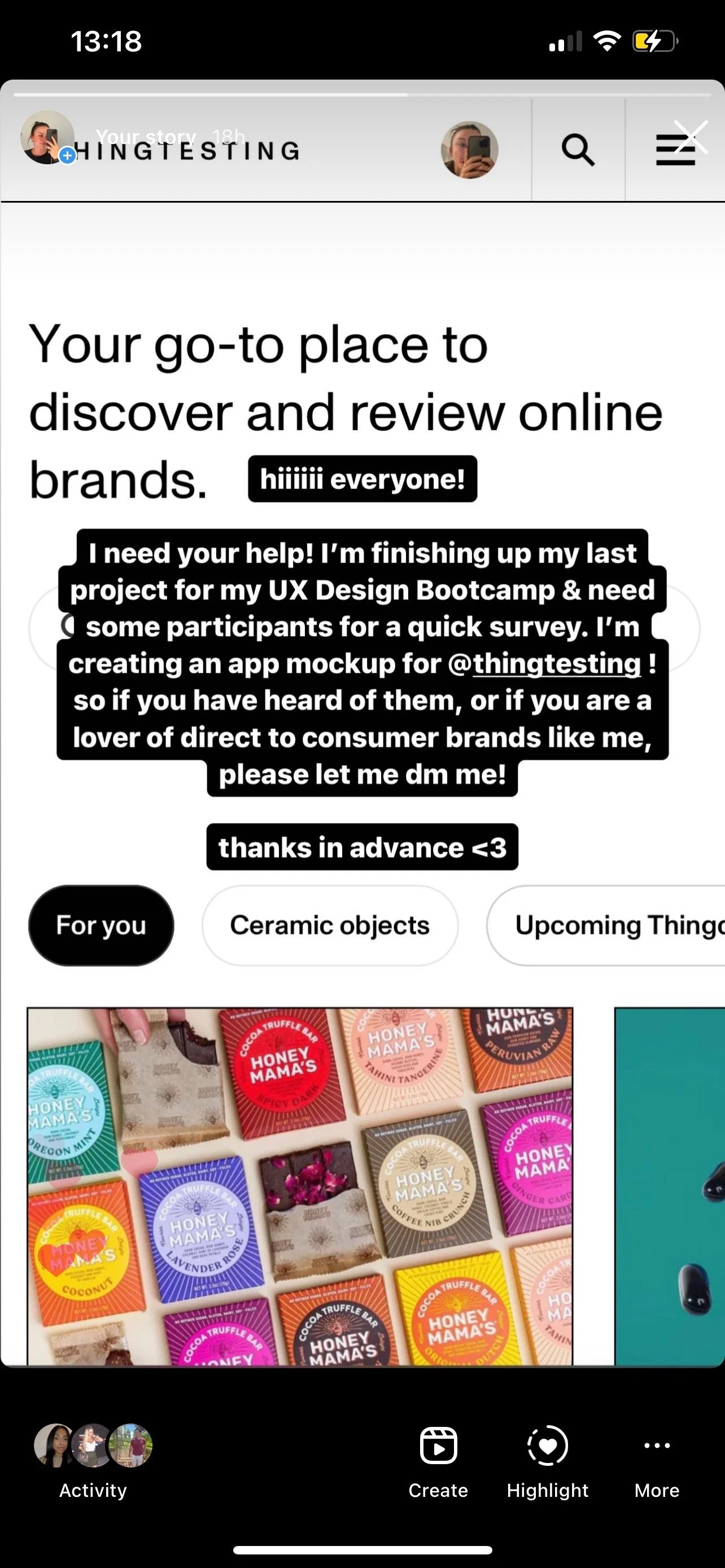
To gather survey participants, I posted to my Instagram story. I chose to send the survey to the first 5 people who responded.
What I gathered from the survey:
Most people are fans of direct to consumer brands
All participants read reviews before making an online purchase
Participants only write their own reviews sparingly
Thingtesting is not being optimally utilized
My main findings from the Empathize phase were that while Thingtesting has very impressive visuals and a wide array of brands on their site, they are just not as well-known as their competitors. I want to help change that.

Olipop Compare/Contrast

Competitor Analysis
Recruiting Participants
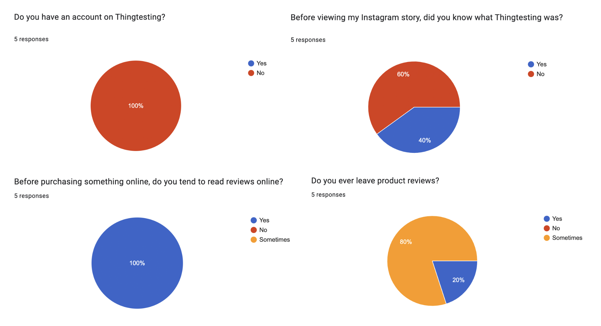
Survey Results
Define
I chose to cumulate my research and convert it into a persona for the ideal Thingtesting user. This way, I always have a person in mind when creating the app. Once this was done, I conducted a constrained brainstorming exercise to narrow down on the Minimum Viable Product (MVP). In 10 minutes, I wrote down every feature (live or not) that came to mind when thinking about the Thingtesting website. Then, I gathered my favorites and chose the MVP.
What I enjoyed most about this brainstorm session was large amount of ideas I was able to come up with. The ideas I didn’t choose from my list either already existed, or were too advanced to make the MVP. This was a very successful brainstorming exercise because I was able to find the MVP and also ideas for future iterations.

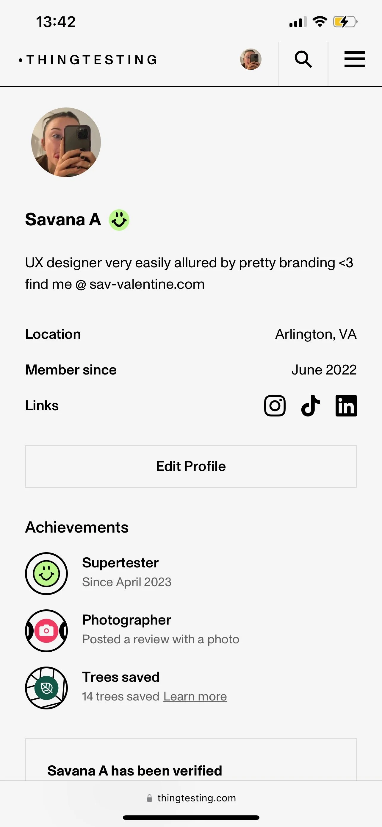
Persona

MVP Brainstorm
Research Synthesis
The Minimum Viable Product is the creation of the Thingtesting app with two additions:
Internal messaging feature
Advanced external share feature
The goal of the MVP will be to reach a larger audience and to form a better connection between existing users.
I chose the Thingtesting app to be the MVP because Thingtesting already has a great website with great UI and features. From my surveys I found that their issue was outreach, and I hypothesize that having an app would increase their number of users.
If I have time…
A Random Brand Generator
This would be a fun addition. I thought about the “I’m Feeling Lucky” button on Google and this would be a great way to explore the huge amount of brands on Thingtesting!
Ideate
In this step, it is time to bring things to life. I did this by creating a sitemap, user flows, task flows, low fidelity wireframes, and a UI kit.
The sitemap is the baseline for the Thingtesting app. You can see the four different bottom navigation buttons and what can be completed on each page. With the sitemap done, the flows and overall organization of the app is seamless.
My goal for the user flows and task flows was to map out the main pathways users will take within the Thingtesting app. From browsing the directory of countless brands, to leaving a review on a specific brand’s page, I mapped it out.
With the previous deliverables complete, I chose to sketch out low fidelity wireframes. Since Thingtesting already has great UI on their mobile site, that is where I based my designs off of. It is important to make the transition from the mobile site to the app seamless, or the user will be confused and ultimately uninterested in the app. That being said, I think the addition of additional sharing features will entice them.
Lastly, to create a coherent and cohesive brand, executed the UI Kit. I recreated buttons from the website, duplicated icons, swatched for the color palette, and created additions like messaging cards and social icons.
With the ideate phase complete, it is time to bring it all together.

Sitemap
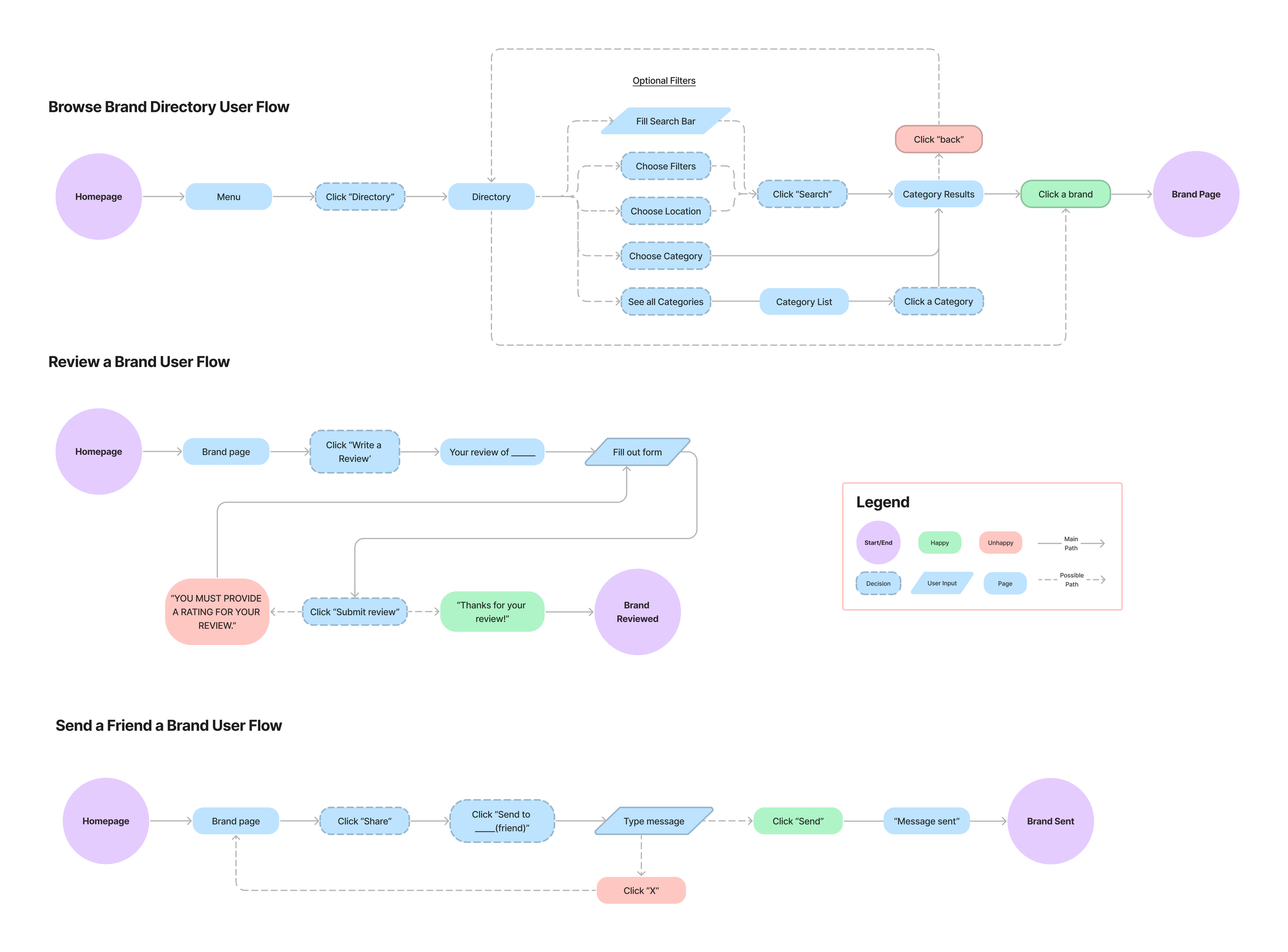
User Flows

Task Flows

Website to Low-Fid Wireframes

Low Fidelity Wireframes
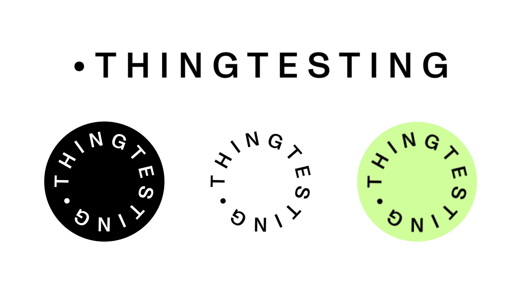
Thingtesting Branding

UI Design
MVP/High-Fid Wireframes
Aside from creating a brand new app, my main priority was the Minimum Viable Product. Below, you can see the main implementations I want to create. They are made up of an internal messaging feature, personal messaging page, friends list, and popup sharing menu. Based upon usual design patterns on Instagram, TikTok, etc, the sharing features should be very easy for users to navigate. I believe the implementation of the MVP will increase Thingtesting’s users and motivate users to use the app.

Internal Messaging

Personal Message

Friends

External Sharing
Key Addition
Out of all the features I have added to the new Thingtesting App, I think the pop-up sharing feature is the most important. This is a “one stop shop” of a feature. You can review or add the brand to your lists like usual, but also share! You can share the brand with your friends who are already on the Thingtesting app or ones that have never heard of it. A text, a tweet, a post, an email… you name it! As I mentioned earlier, Thingtesting has great visual branding so if someone sees an eye catching post on an Instagram Story, there’s a great chance they will check it out. With all these new avenues for increasing reach, I think this will be very beneficial for Thingtesting.
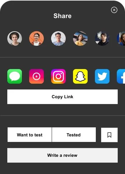
I made my design decisions based upon usual design patterns on popular social media apps. This way, this new feature will be easily adapted by veteran Thingtesters.
Prototype
After creating the MVP and 13 additional screens, it was time to add interactions. I put a lot of time and effort into making these as detailed as possible because I wanted to make this app very realistic.
The prototype is now ready for testing. Check out the Figma prototype below:
Test
I conducted usability tests to understand how users would navigate the app and to iron out any issues that they uncovered. Since they were familiar with my project, I used the same participants from my earlier surveys. They were instructed to complete these 3 tasks:
Find and view the ‘Dossier’ brand page
Visit the profile of ‘Brooke M’ and go your messages with her
Share a brand on Instagram
Below is a screen recording of me fulfilling the tasks users were instructed to complete.
Screen recording of iPhone prototype used for Usability Testing
Implement
User testing went great, but I did want to make one iteration based on the feedback.
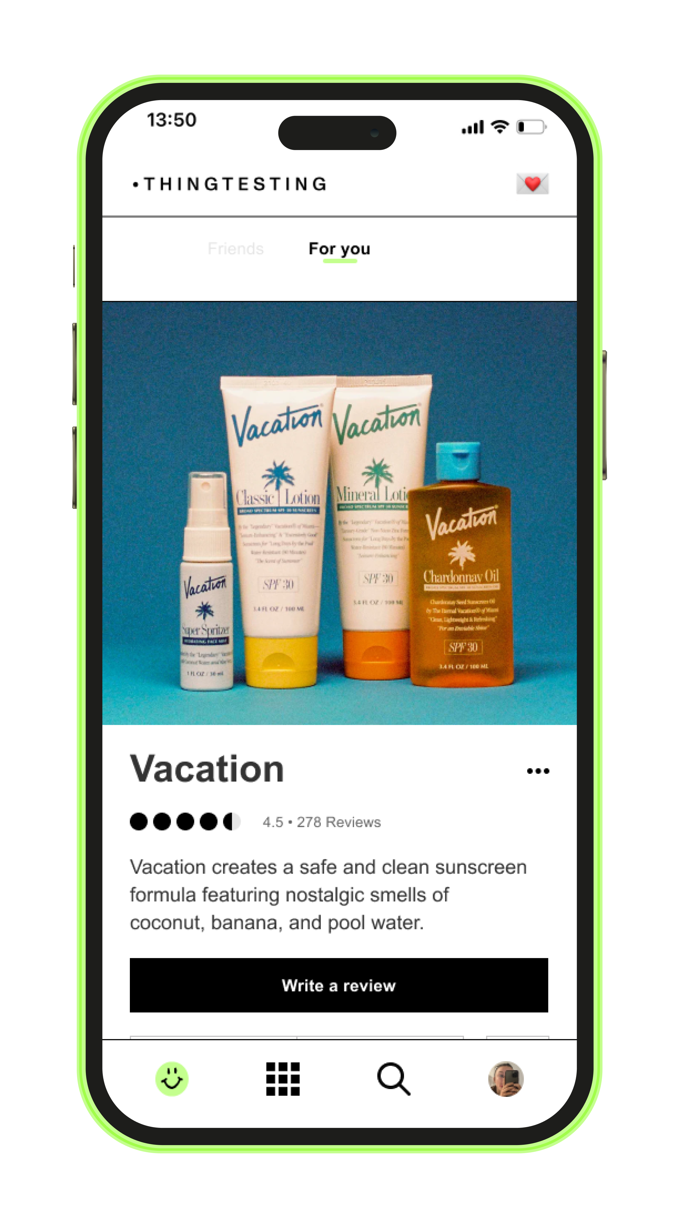
A “For you” page.
3/5 users mentioned they would be interested in an additional page that recommends you brands you might like based on past reviews and bookmarks. Thingtesting has this feature as a filter on their website, but based on usual social media patterns, I decided to place this page as an alternate screen on the main feed. Users can flip between seeing reviews from their friends and seeing recommended brands and reviews from people they do not know.
Below, you can see the new iteration of the home feed:
Screen recording of new “For you” page implementation
Conclusion
If I were to do this all over again, I would interview employees at Thingtesting and Jenny Gyllander herself. No one knows Thingtesting better than them, so their input could help make this even more successful. Getting the input from more Thingtesters would be beneficial as well, because they are the ones who would actually be using this app on a regular basis.
That being said, I am very proud of my creation of this app, the addition of the internal messaging feature, and the addition of the advanced sharing feature.
I believe that with my creation, and the improvements I have made, Thingtesting will increase their reach and number of Thingtesters!


