

The Turn at Kilmarlic Case Study
Tools
Figma, Google Suite
My Role
UX/UI Designer
Project Duration
2 Weeks
Overview
The Turn at Kilmarlic (TTK) is a short-term rental property focused on providing a luxury golf weekend experience. I created a responsive website for them, with the goal of making it a ‘hub’ for all information necessary for future guests.
Being close with the owner, Jeff Bradley, I wanted to help him out by creating this website for him. Since I knew him personally, it was easy to gear the website around his interests and goals for the property.
Background
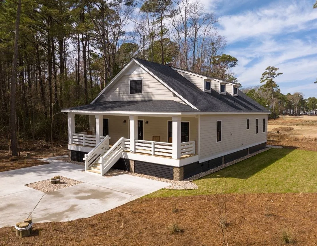
The Turn at Kilmarlic is a new, luxury short-term rental property located on the Outer Banks of North Carolina. They are located right next to the 10th tee box on the Kilmarlic Golf Course. Their name comes from the golf term “the turn” meaning the spot where the front 9 turns into the back 9.”
- The Turn at Kilmarlic
Problem
The Turn at Kilmarlic’s problem is that they are listed on several rental websites like Airbnb, Booked.net, and BeachRealtyNC.com, but do not have a personal website.
Solution
My solution is to create a responsive website for this business. The owner wants this website to be a “hub” for all things TTK like links to rental websites, links to socials, general information, and photos. This will help with increasing bookings and overall exposure.
Methodology
Empathize - Conduct in depth research, competitive analysis, interviews, and surveys.
Define - Cumulate research and reframe it into the ideal TTK guest.
Ideate - Bring ideas to life by creating user flows, task flows, low fidelity wireframes, and UI design.
Prototype - Bring everything together into a high fidelity TTK website prototype.
Test - Run usability tests to identify errors and places for optimization.
Implement - Iterate on prototype based on findings from usability tests.

Empathize
To fully understand TTK, their goals, their competitors, and their users, I conducted a competitive analysis, surveys, and interviews.
I chose to interview/survey 3 guests who had stayed at TTK. Since they were staying there for a golf weekend, they were the ideal target.
Through my market research, I found that The Cottages at Kilmarlic, Modern Boho Getaway, and Sea Oats Hotel were the most similar places to stay to TTK. To make the most direct comparison, I compared them all based on the same characteristics.
The part of the Empathize phase that was the most insightful was my one on one interview with the owner Jeff. Even though I know him personally, the 30 minute interview gave me way more information and guidance than I thought was possible.
My main finding from the Empathize phase was that Jeff wants to create a luxury golf house experience that groups will return to over years to come. Right now, potential guests just aren’t super familiar with the ins and outs of TKK yet. Most of his competitors have a personal website for their properties and I think creating one would be hugely beneficial for TTK.
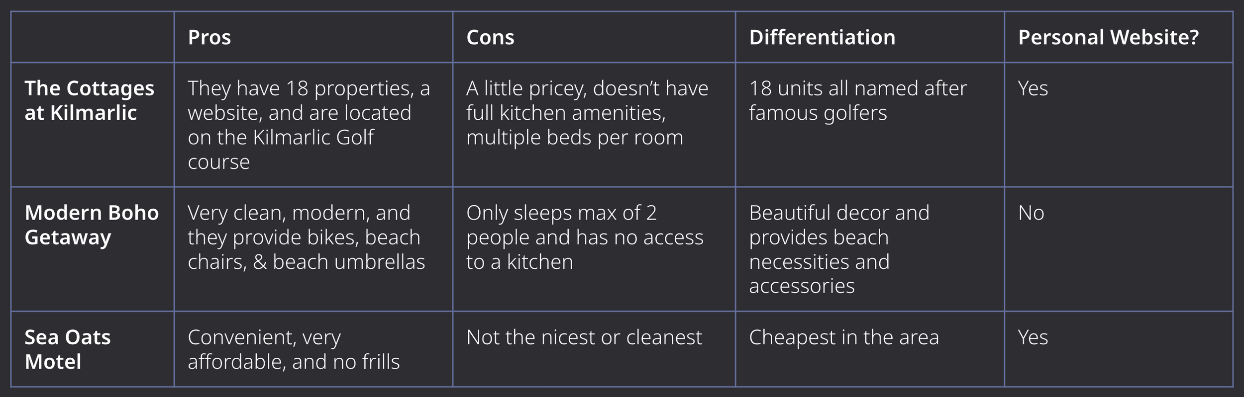
Competitive Analysis
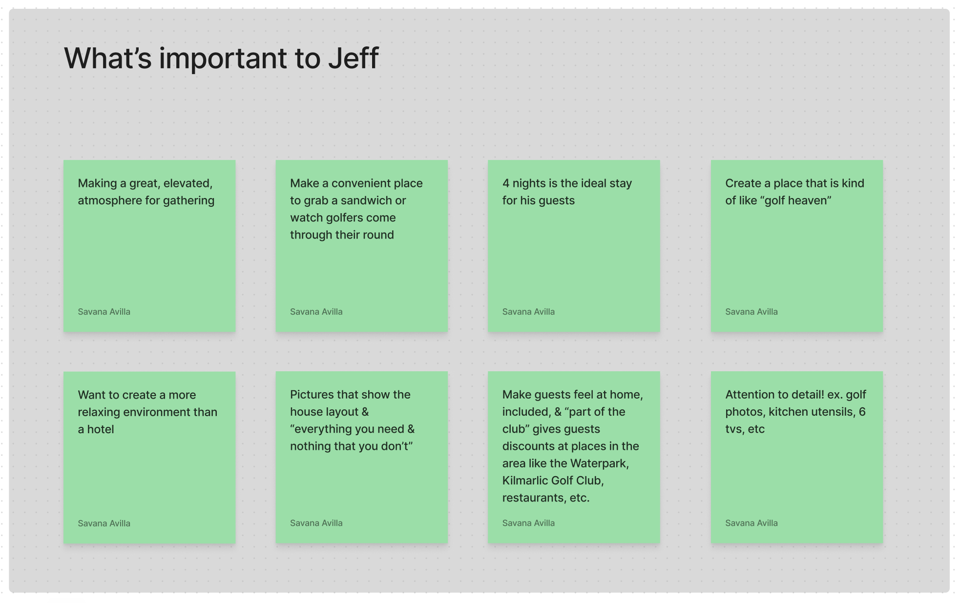
Key points from interview with Jeff, the owner

Jeff's vision

Suggestions from surveys
Define
I chose to cumulate my research and convert it into a persona for the ideal TTK guest. This way, I always have a person in mind when creating the website. It helped that I could speak with guests who had recently stayed the weekend at TTK. Their input was essential to making these accurate.

Persona #1

Persona #2
Ideate
In this step, it is time to being things to life. I did this by creating a sitemap, user flow, task flow, low fidelity wireframes, and UI kit.
The sitemap is the baseline for the TTK website. You can see the main tabs I wanted to have to organize the information about the property. With the sitemap done, the flows and overall organization of the website comes easy.
For the user flows and task flows, I chose to focus on the main paths guests would take on the site. Viewing the photo gallery, booking a stay, and buying merchandise.
When it comes to booking a vacation, it is all about the visuals. I kept this in mind when creating the low fidelity wireframes. I wanted to add lots of eye catching photos of the house, the golf course, and the surrounding area. I also made the “Book” button large and obvious because that is ultimately the goal for the website.
Lastly, was the UI Kit. Jeff already created the logo and mentioned navy blue and gray being the colors he wants to explore. I made sure to create social media icons because Jeff is very active on his Facebook and Instagram pages for TTK.
With the low-fidelity wireframes and UI kit complete, it is time to bring it all together.

Sitemap

User Flows

Task Flows

Desktop low-fidelity wireframes

Mobile low-fidelity wireframes

UI kit
High-Fid Wireframes
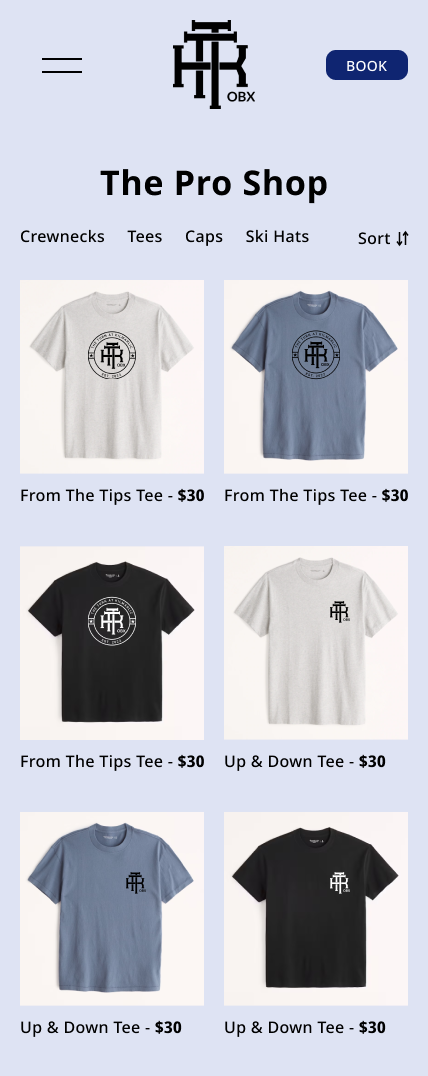
Below, you can see the home page and merchandise page on desktop and mobile. I decided to try out different color combinations to see what I liked, but more importantly what Jeff liked more.
It is important for this to be a responsive website because golfers are not going to have their laptop out on the course (hopefully).


Key Addition
Jeff is very active on social media, so I wanted to make sure the Instagram and Facebook pages for TTK were easily accessible. To the right is a screenshot of the navigation bar with the icons that take you directly to those pages.

Prototype
After creating additional desktop and mobile screens, it was time to add interactions. I put a lot of time and effort into making these as detailed as possible because I wanted to make this app as realistic as possible.
The prototype is now ready for testing. Check out the Figma prototype below:
Test
I conducted usability tests to understand how users would navigate the website and iron out any issues that they uncovered. Since they were familiar with my project, I used the same participants from my earlier surveys and interviews. They were instructed to complete these 3 tasks:
Browse photos
Buy a hat
Book a stay
Below is a screen recording of me fulfilling the tasks users were instructed to complete.
Screen recording of desktop prototype used for Usability Testing
Implement
User testing went great, but I did want to make a few home page iterations based on the feedback.
Key additions:
Added the area of North Carolina that TTK is located
Restated the Golf Course name that TTK is located on
Added a footer
Added some color blocking to separate information and make the page more interesting
To my surprise, users liked the lighter color combination more over the dark one. I personally liked the dark more, but it is up to Jeff. Since he liked the light background, that is what I went with.

Original


New Iteration
Conclusion
Jeff and I are very happy with how the responsive website turned out. It is simple, yet informative. That is exactly what Jeff was looking for.
If I were to do this again, I would look into nation-wide, golf-focused, short-term rental properties for the competitor analysis. Even if they are not located on the Outer Banks, or direct competitors, seeing what these properties are doing well could have enhanced this website.
Overall, this was a success. I believe that with the creation of this website, The Turn at Kilmarlic will increase their reach and number of guests!