
[solidcore] Case Study

My Role
UX/UI Designer
Project Duration
2 Weeks
Tools
Figma, Otter.ai, Google Suite
Overview
[solidcore] is a 50 minute boutique fitness class with over 100 locations across the United States. I created an advanced health metric tracker and made their existing app Apple Watch-compatible. I did this with the goal to motivate existing [solidcore] clients and increase memberships moving forward.

I have a part-time job at [solidcore] that I am very passionate about and have about 150 [solidcore] classes under my belt. [solidcore] has become an integral part of my life and I wanted to create something that would make the experience even better.
Background
“We are committed to making every member of our community feel welcomed, supported, motivated, empowered, and challenged. Our people are open, real, genuine, and positive. We foster love of body, push each other, sweat together, empathize with one another, and always high-five. We are a [team] – under the blue lights and outside of the studio. Whether you’re a coach or a client, every person in our community is dedicated to and invested in helping those around them discover what they’re truly capable of.”
- [solidcore]
Problem
[solidcore]’s problem is that they have a website and app that allows the user to track milestones like number of classes taken, number of studios visited, number of minutes spent “under the lights”, but has no feature for tracking health-centered metrics.
Solution
Our solution is to add a feature that allows the user to open the [solidcore] app on their Apple Watch to track their workout. It will gather data from the user’s heart rate to show them a dashboard of metrics following each class.
Methodology
Empathize - Conduct in auto-ethnographic research, competitive analysis, and contextual interviews.
Define - Cumulate research and reframe it into the ideal [solidcore] client.
Ideate - Bring ideas to life by creating user flows, task flows, low fidelity wireframes, and UI design.
Prototype - Bring everything together into a high fidelity [solidcore] Apple Watch and iPhone prototypes.
Test - Run usability tests to identify errors and places for optimization.
Implement - Iterate on prototype based on findings from usability tests.

Empathize
To fully understand [solidcore], their goals, their competitors, and their users, I conducted contextual interviews, auto-ethnographic research, and a competitive analysis.
I chose to do contextual interviews because I have a part-time role as a [core crew] member at [solidcore], frequently take classes there, and wanted to use this position to my advantage. I already know several people at the studio, so I won’t need to give them an in-deep introduction.
For the auto-ethnographic research, I chose to take a [solidcore] class, Peloton Class, and track a run with Nike Run Club. I picked Peloton and Nike Run Club because they have great apps, are Apple Watch compatible, and competitors of [solidcore].
The main findings from the contextual interviews, auto-ethnographic research, and competitive analysis are as follows:
Most [solidcore] clients are active Apple Watch users, fitness-motivated, and open-minded
The more favorable fitness apps show abundant data visually
My main finding from the Empathize phase was that [solidcore] is a popular, high-end boutique fitness studio but is missing out on the wearable tech space. Most of their users are already tapped in, so I want to help [solidcore] bridge this gap.

Auto-ethnography

Competitive analysis

3 contextual interview participants
![How [solidcore] clients track their workout](https://images.squarespace-cdn.com/content/v1/64023d1b3b5184111e50eaf4/1688478044605-UU3HQHOV2NAO4VTOX8DL/IMG_5454.jpg)
How [solidcore] clients track their workout
Define
I chose to cumulate my research and convert it into personas for ideal [solidcore] clients. I was really happy that I chose to do contextual interviews because they helped me mold the persona into people that I could see coming into the studio.

Persona #1

Persona #2
Ideate
In this step, it is time to being things to life. I did this by creating a sitemap, user flow, task flow, low fidelity wireframes, and UI kit.
I modeled the sitemap after the existing [solidcore] app, but added the option to track a workout to the bottom navigation bar.
To make the user flows and task flows, I first showcased two paths users could take on their app; booking a class and sharing a badge. My new addition was the flow to start a workout on the Apple Watch. I based this path on usual UI patterns found in Apple Workouts, Nike Run Club, and Peloton.
My low fidelity wireframes were sketched based on the pre-existing [solidcore] app and the Apple Watch compatible apps listed above.
For the UI Kit, I waned to create a coherent and cohesive brand, I recreated buttons from the website, duplicated icons, swatched for the color palette, and created additions like messaging cards and social icons.
With the ideate phase complete, it is time to bring it all together.

Sitemap

User Flows

Task Flows

Low fidelity wireframes
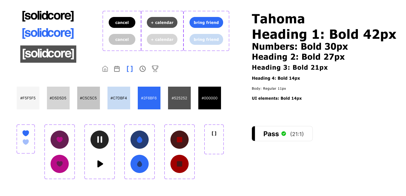
UI Kit
High-Fidelity Wireframes
Below, you can see the fitness metrics pages on the iPhone. Since the Apple Watch’s main way of tracking workouts is through heart rate differences, I created a graph to show how your heart rate fluctuates during the workout. You will then see your heart rate minimum, maximum, and average. Based on those readings, we are able to approximate calories burned during the class.
On the Apple Watch, you can see the starting page, and what the watch looks like during the workout. I made sure to make the buttons large because it can get difficult to tap tiny buttons during a workout.


Key Screen
This screen is the most important one in the workout flow. Based upon my auto-ethnographic research, I realized that if you accidentally ended a workout early, you were out of luck. You could not restart the workout. Taking this into account, I made sure to add an “are you sure” screen. This helps minimize user error while pushing buttons on the Apple Watch. The [solidcore] studio is pretty dark and clients could have sweaty hands, so this is just an extra precaution!

Prototype
After creating the iPhone and Apple watch screens, it was time to add interactions. I put a lot of time and effort into making these detailed because I wanted to make the new Stats page and Apple Watch screens as realistic as possible.
The prototypes are now ready for testing. Check out the Figma prototypes below:
iPhone
Apple Watch
Test
I conducted usability tests to understand how users would navigate the iPhone and Apple Watch app and iron out any issues that they uncovered. Since they were familiar with my project, I used the same participants from my contextual interviews. They were instructed to complete these 3 tasks:
Start a workout
Complete a workout
View post-workout metrics
Below is a screen recording of me fulfilling the tasks users were instructed to complete.
Screen recording of Apple Watch and iPhone prototype used for Usability Testing
Implement
User testing went great, but I did want to make one iteration based on the feedback.
3/5 users had difficulty differentiating between what is a button and what is not when it comes to the '“stats” page. To solve this, I made the progress bar the full width of the screen. I kept the buttons two-dimensional to match the other buttons throughout the [solidcore].
Original Prototype
New Iteration


Conclusion
With the addition of the health metric tracking feature and Apple Watch compatibility, [solidcore] clients can now take their fitness journey to the next level by seamlessly tracking their progress and staying motivated throughout their workout.
If I were to do this again, I would interview more [solidcore] clients. They are the ones that will be using this Apple Watch integration, so their input is very important.
Overall, I am very happy with this project. I believe that with these improvements, [solidcore] clients will become more motivated and [solidcore] will increase their amount of memberships!